Building blocks
Getting to know your building blocks
Zervicepoint has a number of fields and activities which are building blocks for a service.
| Fields | Activities |
|---|---|
 |
 |
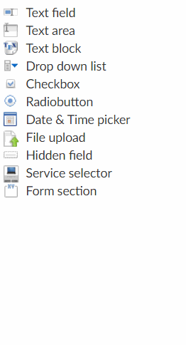
| Explore the form fields | |||
|---|---|---|---|
| Text field | Text area | Text block | Drop down list |
| Checkbox | Radiobuton | Datetime picker | File upload |
| Hidden field | Service selector | Form section | Form editor |
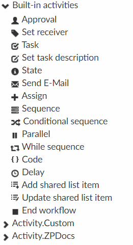
| Explore the workflow activites | |||
|---|---|---|---|
| Approval | Set Receiver | Task | Set task description |
| Send e-mail | Assign | Sequence | Conditional sequence |
| Parallel | While sequence | Code | Delay |
| Add shared list item | Update shared list item | End workflow |
Form editor
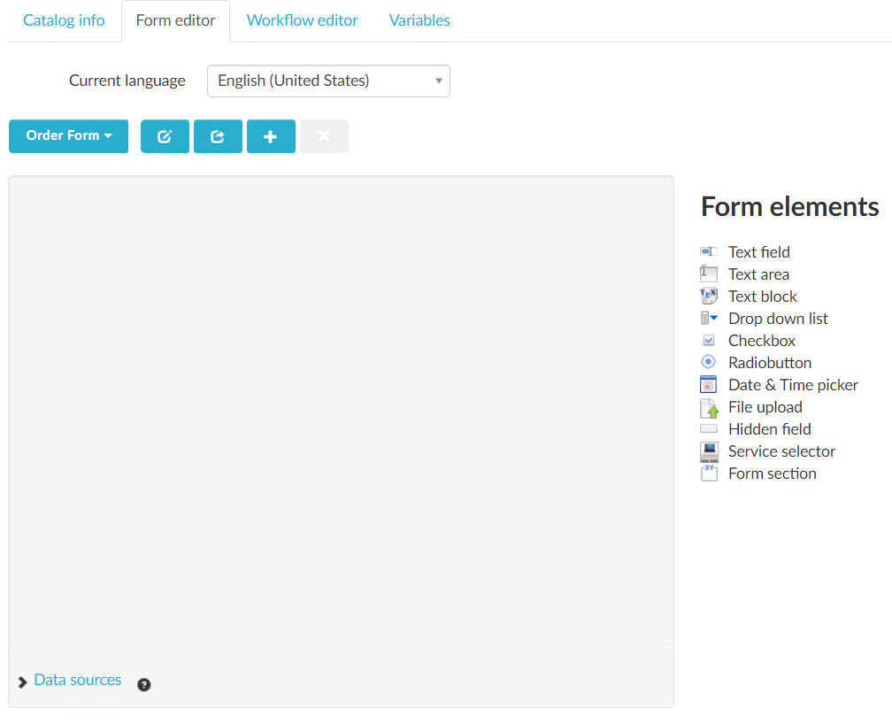
The form editor is the tool to use in order to add forms, fields, translation, data sources and edit javascripts.
| Form Editor | Comment |
|---|---|
| Current Language | Translatable content such as display fields will be translated to this language. The information will have to be added in each language |
| Form selection | From this section you can create, edit or delete forms that should be available in your service. Often you may want to have a different form displayed for the approver. |
| Data sources | Select and add a webservice that should be accessible using ZP JS API. Only added webservices are accessible. |
| Form elements | Drag and drop fields to the canvas to add them. |
Explore text fields
Create a service to learn how text fields behave.
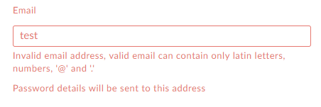
Include common scenarios, such as email validation, etc. Feel free to explore!

| Attribute | Description |
|---|---|
| Identifier | This is the element name, mainly used when you want to modify the field using javascript |
| Name | Name shown in the form for an end user |
| Description | Descriptive text that is shown beneath the name field |
| BindTo | Value in this element will be bound to this variable |
| Character limit | Add a maximum character limit to a text field (.i.e 144) |
| Validation | None, Name, Email, Numerical, Alphanumeric, Custom |
| Validation message | Custom validation message created using regex |
| Size | Modify element size |
| Readonly | Field is set to readonly |
| Hidden | Field is hidden when service is loaded |
| Line break | A line break will be added after this field in the form |
| Default value | Default value added when service is loaded |
Explore the text area
| Attribute | Description |
|---|---|
| Identifier | This is the element name, mainly used when you want to modify this field using javascript. |
| Name | What is shown in the form for the end user |
| Description | A descriptive text under the field |
| Hidden | The field is hidden when service is loaded |
| BindTo | Value in this element will be bound to this variable |
| Rows | Adjust the number of rows. |
| Required | Make this field a requirement to complete in order to place order. |
| Validation | None, Name, Email, Numerical, Alphanumeric, Custom |
| Validation message | Custom validation message |
| Size | Modify element size |
| Full width | Uncheck this if you want to include sections side by side, when unchecked the width of the section will be dependant on the size of the elements inside it. |
| Full width checked |  |
| Full width unchecked | 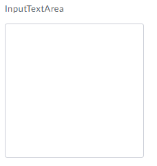 |
| Readonly | Field is readonly |
| Hidden | Field is hidden when service is loaded |
| Line break | A line break will be added after this field in the form |
| Default value | Default value added when service is loaded |
Explore the text block
| Attribute | Description |
|---|---|
| Identifier | This is the element name, mainly used when you want to modify this field using javascript. |
| Name | What is shown in the form for the end user |
| Description | A descriptive text under the field |
| BindTo | Value in this element will be bound to this variable |
| Text | HTML Text block |
| Hidden | The field is hidden when service is loaded |
| Line break | A line break will be added after this field in the form |
Explore the drop down list
A drop down list is great when you want the user to select a choice from a drop-down list. The data source for the drop-down is either static or dynamic. When using a static drop-down, you can add the items presented in the data source in the form editor. With a dynamic drop-down, the data source is PowerShell or a C# code running on the ClientWebService role.
| Attribute | Description |
|---|---|
| Identifier | This is the element name, mainly used when you want to modify this field using javascript. |
| Name | What is shown in the form for the end user |
| Description | A descriptive text under the field |
| BindTo | Value in this element will be bound to this variable |
| Required | Make this field a requirement to complete in order to place order. |
| Size | Modify element size |
| Full width | Uncheck this if you want to include sections side by side, when unchecked the width of the section will be dependant on the size of the elements inside it. |
| Full width checked |  |
| Full width unchecked |  |
| Hidden | The field is hidden when service is loaded |
| Line break | A line break will be added after this field in the form |
| Searchable | Enable search, it will search the Label field in a static drop-down. In a dynamic drop-down the search is used as input to the Search parameter. |
| Multi select | Allow selection of multiple drop-down items. The delimiter used is ; when bound to a variable. (Value1;Value2) |
| Allow clear | Enables the option to clear value in a drop-down (Adds a small x) The default behaviour is that the first item in a drop-down list is selected unless Allow clear is enabled, or the field is made searchable. |
 |
|
| Placeholder | Change the Click to select value to another value This setting is only available when Multi Select or Allow Clear is enabled. |
| Default |  |
| Custom |  |
| Restricted | Does not allow values to be dynamically modified. A Drop down with a dynamic data source is restricted by default. This setting cannot be changed. |
| Unrestricted | Values must be added using ZervicePoint JS-API. This mode should not be used for drop downs that contains information that in any way can be sensitive. The data can be changed by ZervicePoint JS-Api / client web browser. |
| Dynamic bind | Changes the data source from a static drop-down to a dynamic drop-down. |
| Data Source | Select a PowerShell or C# function to use as data source. This option is available when Dynamic bind is enabled |
 |
|
| Use dynamic search delay | There will be a dynamic delay before a search call is sent to clientwebservice. |
| Use client cache | Allow data source to cache data, this may improve the search time for the user when searching again |
| Minimum length to begin search | The number of characteres that must be typed before a search call is sent to clientwebservice |
For more details about Data Sources
Drop-down list items

| Attribute | Description |
|---|---|
| Selected | Selected choice when service is presented to the user |
| Label | Label presented to the user in the form |
| Value | value that is bound to variable and passed to workflow |
| Cost | Cost of item, all selected items will be added to the System.Order.Cost variable |
| Monthly Cost | Monthly cost of item, all selected items will be added to the System.Order.MonthlyCost variable |
| Add dropdown item | Adds an additional item |
Explore the checkbox
A checkbox is similar to a drop down list, however it is not possible to search in it. The data source is either static or dynamic. When using a static checkbox, you can add the items presented in the data source in the form editor. With a dynamic checkbox, the data source is PowerShell or a C# code running on the ClientWebService role.
| Attribute | Description |
|---|---|
| Identifier | This is the element name, mainly used when you want to modify this field using javascript. |
| Name | What is shown in the form for the end user |
| Description | A descriptive text under the field |
| BindTo | Value in this element will be bound to this variable |
| Cost | Cost of item, all selected items will be added to the System.Order.Cost variable |
| Monthly Cost | Monthly cost of item, all selected items will be added to the System.Order.MonthlyCost variable |
| Multi select | Allow selection of multiple checkbox items. The delimiter used is ; when bound to a variable. (Value1;Value2) |
| Required | Make this field a requirement to complete in order to place order. |
| Size | Modify element size |
| Full width | Uncheck this if you want to include sections side by side, when unchecked the width of the section will be dependant on the size of the elements inside it. |
| Full width checked |  |
| Full width unchecked |  |
| Readonly | Field is readonly |
| Line break | A line break will be added after this field in the form |
| Hidden | The field is hidden when service is loaded |
| Dynamic bind | Changes the data source from a static checkbox to a dynamic checkbox. |
| Data Source | Select a PowerShell or C# function to use as data source. This option is available when Dynamic bind is enabled |
 |
Explore the radio button
A radio button is similar to a checkbox, the main difference are the following:
- You can only select one choice
- You can't de-select your choice
- It can't be bound to a data source
| Attribute | Description |
|---|---|
| Identifier | This is the element name, mainly used when you want to modify this field using javascript. |
| Name | What is shown in the form for the end user |
| Description | A descriptive text under the field |
| BindTo | Value in this element will be bound to this variable Type: String |
| Required | Make this field a requirement to complete in order to place order. |
| Size | Modify element size |
| Full width | Uncheck this if you want to include sections side by side, when unchecked the width of the section will be dependant on the size of the elements inside it. |
| Full width checked |  |
| Full width unchecked | 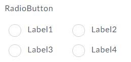 |
| Readonly | Field is readonly |
| Hidden | The field is hidden when service is loaded |
| Line break | A line break will be added after this field in the form |
Explore the date & time picker
| Attribute | Description |
|---|---|
| Identifier | This is the element name, mainly used when you want to modify this field using javascript. |
| Name | What is shown in the form for the end user |
| Description | A descriptive text under the field |
| BindTo | Value in this element will be bound to this variable. Type: DateTime |
| Required | Make this field a requirement to complete in order to place order. |
| Size | Modify element size |
| Full width | Uncheck this if you want to include sections side by side, when unchecked the width of the section will be dependant on the size of the elements inside it. |
| Full width checked |  |
| Full width unchecked |  |
| Readonly | Field is readonly |
| Hidden | The field is hidden when service is loaded |
| Line break | A line break will be added after this field in the form |
| Default value | Set default date |
| Selectable date | Display date field |
| Selectable time | Display time field |
Explore the file upload
| Attribute | Description |
|---|---|
| Identifier | This is the element name, mainly used when you want to modify this field using javascript. |
| Name | What is shown in the form for the end user |
| Description | A descriptive text under the field |
| BindTo | Value in this element will be bound to this variable. Type: File |
| Required | Make this field a requirement to complete in order to place order. |
| Size | Modify element size |
| Readonly | Field is readonly |
| Hidden | The field is hidden when service is loaded |
| Line break | A line break will be added after this field in the form |
File upload example
Explore the hidden field
Hidden fields are not shown in the form and are useful when you want to build a result from the form using javascript and bind it into a variable.
| Attribute | Description |
|---|---|
| Identifier | This is the element name, mainly used when you want to modify this field using javascript. |
| Name | What is shown in the form for the end user |
| Description | A descriptive text under the field |
| BindTo | Value in this element will be bound to this variable. |
| Default value | Set default value |
Explore the service selector
Service Selector is a dropdown which data source are published services. It's commonly used for software/hardware services.
You may have service for ordering an phone, computer and accessories, but want to include the selection of these services in a "New Employee" scenario.
| Attribute | Description |
|---|---|
| Identifier | This is the element name, mainly used when you want to modify this field using javascript. |
| Name | What is shown in the form for the end user |
| Description | A descriptive text under the field |
| BindTo | Value in this element will be bound to this variable. |
| Required | Make this field a requirement to complete in order to place order. |
| Default value | Set default value |
| Readonly | Field is readonly |
| Hidden | The field is hidden when service is loaded |
| Line break | A line break will be added after this field in the form |
| Searchable | Enable search, it will search the Label field in a static drop-down. In a dynamic drop-down the search is used as input to the Search parameter. |
| Multi select | Allow selection of multiple items. The delimiter used is ; when bound to a variable. (Value1;Value2) |
| Default Services | Default service selection onload |
| Selection Criteria (Page) | Filter services under this page |
| Selection Criteria (Tag) | Filter services with this tag |
Explore the form section
The form editor allows you to organize elements to different sections in a form. You can make it more user-friendly by grouping fields to a topic, such as User information, Settings, Requester etc.
| Attribute | Description |
|---|---|
| Identifier | This is the element name, mainly used when you want to modify this field using javascript. |
| Name | What is shown in the form for the end user |
| Description | A descriptive text under the field |
| Hidden | The field is hidden when service is loaded |
| Line break | A line break will be added after this section in the form |
| Align fields by | Adjust the order in which elements are listed, by default they are listed in a row. |
| Show header and background | By default, the Name value is shown including a background color. |
| Full width | Uncheck this if you want to include sections side by side, when unchecked the width of the section will be dependant on the size of the elements inside it. |
| Full width checked | 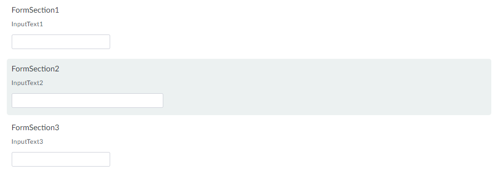 |
| Full width unchecked |  |
Adding a form section and form contents:
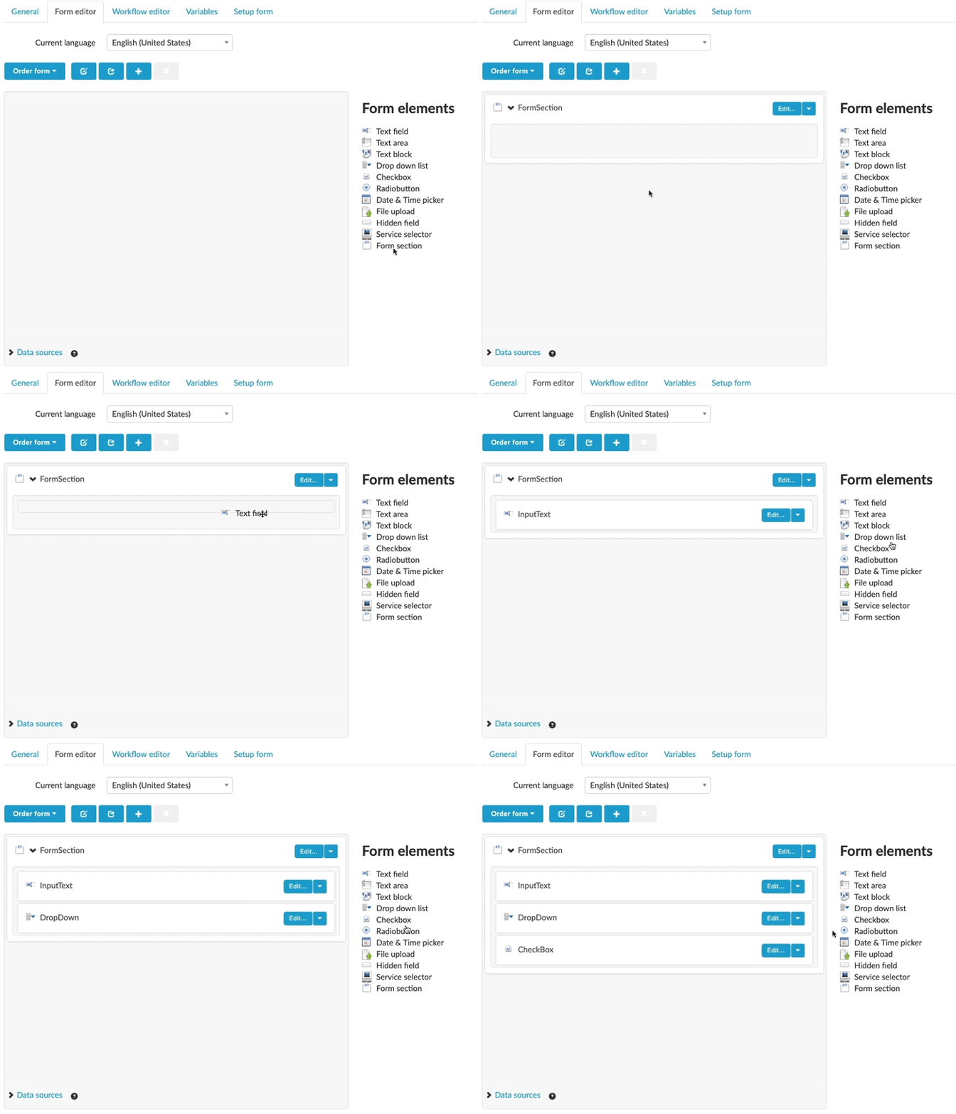
To change the size of your form elements:
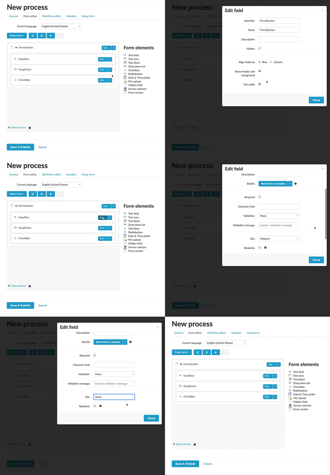
Explore the form editor
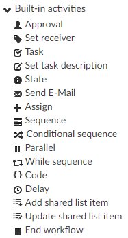
Workflow editor - Built-in activities
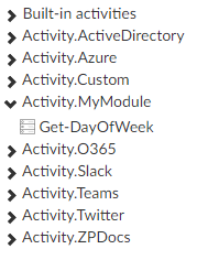
What is an Activity? An Activity in ZervicePoint is a building block when creating a Workflow. Activities are the things that "do the work" and make things happen in your Workflow. An Activity can be either one of the built-in activities shipped with ZervicePoint, Activities made available by buying a Plugin or a custom Activity that you have built yourself.
- Built-in: Examples are Send Email, Set State, Assign, Approval etc. Part of the core product. Runs on Process System.
- Inventoried: Examples are New-ADUser, Enable-S4BUser, Get-ZPO365User. Scripts from disk. Can be custom made or from plugins. Runs on Provisioning System.
Approval
Activity that generates an approval task to one or several users. By default the workflow will stop after this activity if the task is not approved by the appointed approver(s) before the timeout. The workflow can contain several approval activities.
Approvers
| Attribute | Description |
|---|---|
| Users Manager | Uses the Active Directory attribute ”managedby” on the requesters AD-Account to determined the approver |
| User | Manually type the e-mail address for one or several users |
| Service Owner | The user configured as the owner of the service |
| Variable | A variable (string) containing email-addresses separated by semicolon. This is useful when the approver needs to be fetched from another activity or a form field. |
Approval Events
Run workflow activities when events occur. Events are triggered by the approval activity.
| Attribute | Description |
|---|---|
| On each approval | Activities placed in this container runs once every time an approver approves the task |
| On each reject | Activities placed in this container runs once every time an approver rejects the task |
| On each timeout | Activities placed in this container runs once every time the task times out. (Once for every approver) |
| On approval | Activities placed in this container runs once when the entire approval activity finishes with ”Approved” status |
| On reject | Activities placed in this container runs once when the entire approval activity finishes with ”Approved” status |
More Settings
Form
Define what form should be rendered for the approver(s). By default the request form will be used.
Type
| Attribute | Description |
|---|---|
| Parallel | All configured approvers will get the task at the same time |
| Sequence | One approver after the other will get the task. The order is defined in the Approvers section described above. If a variable is used, the order of the values will be used, eg. email1,email2,email3 etc. |
Required
| Attribute | Description |
|---|---|
| One approval | Requires only one approver to approve the task. |
| All approvals | Requires all approvers to approve the task. |
On Timeout
| Attribute | Description |
|---|---|
| Reject | The task will be rejected if no action has been taken by any of the approvers before the timeout event is triggered. |
| Approve | The task will be approved if no action has been taken by any of the approvers before the timeout event is triggered. |
Timeout
The amount of time before the “On Timeout” event is triggered.
Approval Result
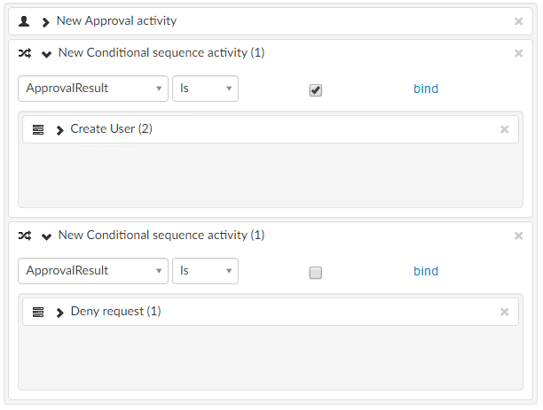
The result of the activity populated to a bound variable (Boolean). A common use case is to combine with a Conditional Sequence activity.
Notify approver(s)
Sends an e-mail to the approvers when the approval task is created. (The default e-mail template can be customized via the Mail Template editor). This option can be dynamically set by binding it to a variable (Boolean).
Use Custom E-mail Template
To specify another e-mail template than the default for the notification.
Remind Approvers
Send an e-mail reminder to the approver(s) after a configured time
| Attribute | Description |
|---|---|
| Remind before timeout | The reminder will be sent when there is this amount of time left before the approval task reaches timeout. Note: If a variable is used to set this value it should contain the time in Seconds. Example 86400 for 24 hours. (60sec * 60min) * 24h = 86400 seconds. |
| Use Custom E-mail Template | To specify another e-mail template than the default for the reminder notification. |
Scenarios/Examples
Add link to some example usage guides...
Set receiver
Updates the receiver of the order, by default the user who placed the order will be the requester and receiver.
This is commonly used in services where you would order an item for another use, and you want visibility in the orders view of who the order was for.

Set receiver takes a string input and should match the email address.
Updating the receiver will as well update the related system variables for receiver.
Task
Activity that generates an task to one or several users. By default the workflow will not continue after the due date is passed. When the task is completed the workflow will continue. A task can have several state activites and include additional activities within its "OnChange" event.
| Identifier | Example |
|---|---|
| Short description | What is shown in the form for the end user |
| Example | 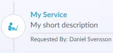 |
Assign To
| Attribute | Description |
|---|---|
| Users Manager | Uses the Active Directory attribute ”managedby” on the requesters AD-Account to determined the approver |
| User | Manually type the e-mail address for one or several users |
| Service Owner | The user configured as the owner of the service |
| Variable | A variable (string) containing email-addresses separated by semicolon. This is useful when the approver needs to be fetched from another activity or a form field. |
Task Events
| On change |
|---|
| Activities placed in this container runs once every time an assignee approves the task |
Form
Define what form should be rendered for the assignee. By default the request form will be used.
Due in
The amount of time before the "Due in" event is triggered. By default, the task will remain but be showned as it has past its "due date".
Set the setting "Complete task when due" in order to stop task when reaching due date. You can bind this result to a variable (boolean).
Notify assignee(s)
Sends an e-mail to the assignees when the task is created. (The default e-mail template can be customized via the Mail Template editor). This option can be dynamically set by binding it to a variable (Boolean).
Use Custom E-mail Template
To specify another e-mail template than the default for the notification.
Remind Assignees
Send an e-mail reminder to the approver(s) after a configured time
| Attribute | Description |
|---|---|
| Remind before timeout | The reminder will be sent when there is this amount of time left before the approval task reaches timeout. Note: If a variable is used to set this value it should contain the time in Seconds. Example 86400 for 24 hours. (60sec * 60min) * 24h = 86400 seconds. |
| Use Custom E-mail Template | To specify another e-mail template than the default for the reminder notification. |
Task Result
This value will contain the value from the state which completed the task.
States
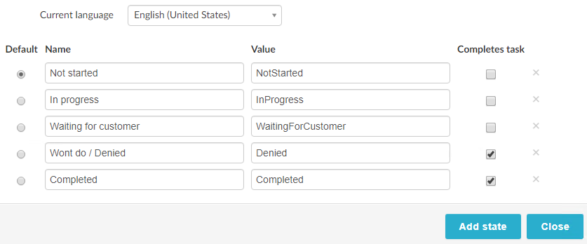
A task is created with the following states NotStarted, InProgress, Completed. When a state is changed to a state where it will complete the task, the workflow will continue.
- A task must always have a default state assigned to it
- A task must contain at least 2 states (One Default, one Complete Task)
- Multiple states can be set to complete a task.
You can edit or add your own states. For example: Draft, Not needed, Waiting for customer, Wont do
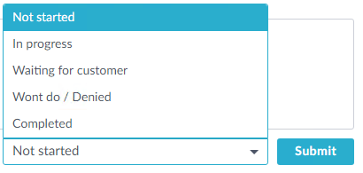
In the UserWeb the assignee will see the following:
Task Variables
There are system variables which are available only within the Task Events. In order to use them outside of the task activity, you should assign them to a non-system variable within the OnChange event.
| Name | Example | Comment |
|---|---|---|
| System.Assignee.Email | bob@example.com | Is a comment needed here? |
| System.Assignee.FullName | Bob | |
| System.Assignee.Username | bob | |
| System.Task.ChangeTime | 09/09/2019 14:12:00 | |
| System.Task.Comment | the quick brown fox jumps over the lazy dog | |
| System.Task.Completed | False | |
| System.Task.Id | 6fca76b7-a046-4198-a797-82e6953138b9 | |
| System.Task.PreviousStatus | NotStarted | |
| System.Task.Status | InProgress |
Scenarios/Examples
Add link to some example usage guides...
Set task description
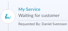
This activity can only be used within a Task OnChange event. It is used to update the "Short Description" in a task.
Send e-mail
| Name | Comment |
|---|---|
| Override from address | When set to true, displays From field. |
| From | A static string or variable (string) contain a single email-address (will override from address configured in Store E-Mail Settings) |
| To | A static string or a variable (string) containing email-addresses separated by semicolon. |
| Cc | A static string or a variable (string) containing email-addresses separated by semicolon. |
| Bcc | A static string or a variable (string) containing email-addresses separated by semicolon. |
| Use custom e-mail template | To specify e-mail template. |
| E-mail Template | See E-Mail Templates for more info. (ADD LINK) |
| Subject | Subject of email message if no e-mail template is used. |
| Body | Body of email message if no e-mail template is used. |
| End workflow on error | Terminate workflow if an error occured during the send activity |
| Attachments | File variable attachments. Attachments either from File Upload or ZPAPI. |
Scenarios/Examples
Add link to some example usage guides...
Assign
Format the text you want to assign to a variable by entering text into the body field. If you want to insert a variable into the text, type the @ character and select a variable.

This activity is typically used when you want to combine the result of multipe variables in order to create a status message for the user, or maybe a HTML/Json object for use in another activity.
Sequence
Sequence blocks can be used to help organize actvities into different blocks of activities.
Conditional sequence
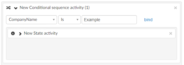
Conditional Sequence blocks are essentialy "If" statements where you can add a condition to check if the workflow should "step into" this sequence block.
Example 1
Example 2
Parallel
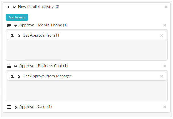
A parallel blocks can be used to run activites in parallel within a workflow. A typical case is when you want to create several tasks/approvals that does not have a order that they can be completed.
Note: You cannot mix tasks/approvals with other activity types
While sequence
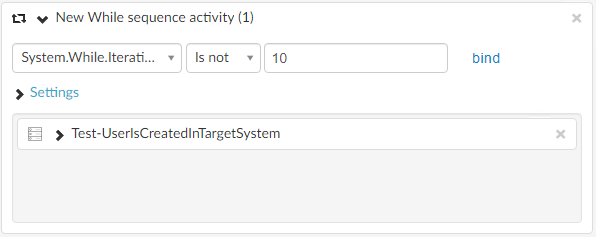
A while sequence will loop the activities until the condition to escape it is met.
- Condition Is string
- Condition Is not string
- Condition Is boolean
- Condition Is not boolean
You can modify the iteration delay for each loop by updating the Iteration delay. The setting can be bound to a decimal variable.
While Sequence Variable
Explain System.While.IterationCounter
There are system variables which are available only within the While Sequence Activities.
| Variable | Comment |
|---|---|
| System.While.IterationCounter | Start value is 1 and is increased by 1 every loop |
Example 1
Code
The Code activity let you transform variables in the workflow using JavaScript. This is useful for data transformation, string manipulation, validation of data, business logic etc.
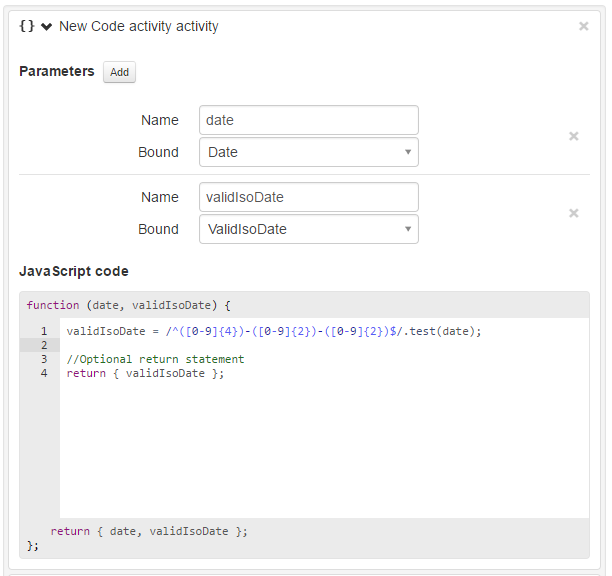
The image below show the Code activity when you use it in the workflow editor. The setup consist of two parts. Creating parameters and then the JavaScript code block.
In order for variables to be available in the code block you first have to create parameters and bind them to a variable. The function definition will automatically be updated in the code block to reflect your changes to parameters, showing which parameters will be available in the code block. Variables that you have created by yourself can be both read and assigned to in the code block. System variables can only be read and not manipulated.
In the code block you write custom JavaScript code that operates on the input parameters. By default, all input parameters are also returned but if you only want to return a subset of parmeters you can use a return statement returning a JS object with the parameters you want to return (as shown in the image below).
Example 2 Combine Code Activity + Delay
In this example we should show how you can dynamically add 3 days to a datetime and then combine a delay.
Delay
Pauses the workflow for a set duration, set a static delay in hours, minutes and seconds or bind the delay to a decimal variable.
Add shared list item
Adds data to a Shared List. For more information on how to use shared list please see this page.
Update shared list item
Updates data to an existing Shared List item. For more information on how to use shared list please see this page.
End workflow
Ends the workflow.